
Case Study
Brand Identity & Visual Direction
Client / Industry
Veronica Hunt is a relationship coach serving middle-aged men and women who want to heal from life and relationship disappointments, reconnect with themselves, and rediscover love.
Her work is personal, emotional, and transformational—requiring a brand presence that feels just as welcoming and supportive as the experience she wants to create for her clients.
Challenge
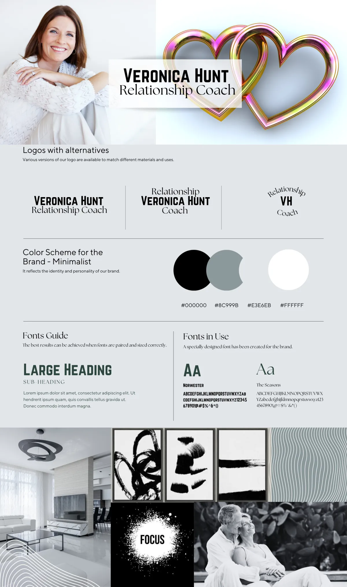
Veronica’s original branding had a clean, minimalist look, but it did not fully communicate the warmth, emotional connection, optimism, and transformation at the heart of her coaching practice.
The black, white, and gray palette created a more corporate and impersonal impression, while the multicolored heart imagery lacked the visual refinement and cohesion needed to position the brand with greater confidence.
The challenge was to create an identity that felt:
Warm and emotionally inviting
Feminine without becoming overly delicate
Professional and polished
Hopeful and relationship-focused
Consistent across digital platforms
BEFORE
Cold • Minimal • Limited Emotional Connection
• Inconsistent Brand Personality
Brand Transformation
Creation
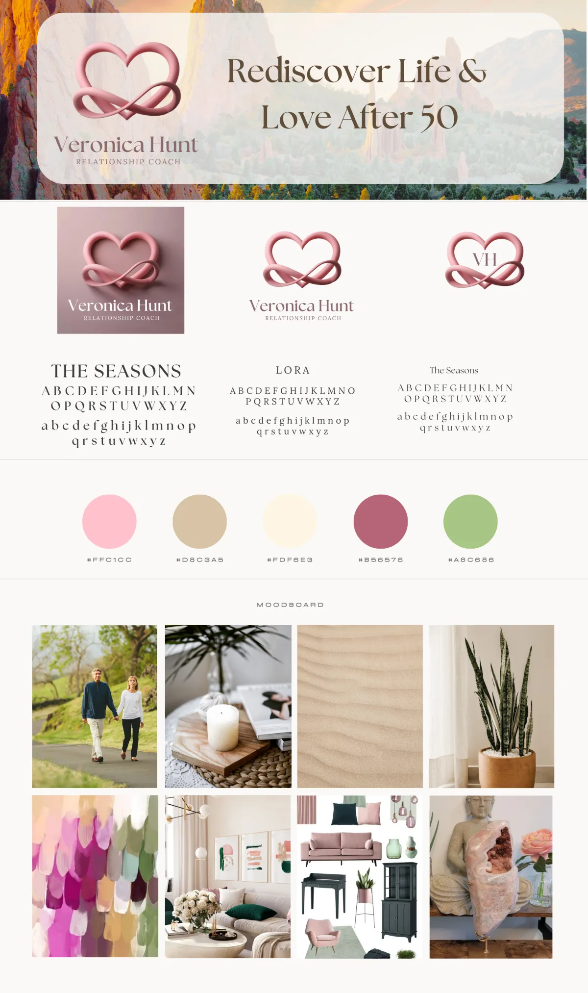
Veronica's now has a refreshed brand identity and visual direction designed around her message of reconnecting with love and self in midlife.
The new creative direction included:
A refined interlocking-heart logo concept symbolizing
love, connection, and renewalA warm color palette featuring blush, rose, cream,
muted green, and soft neutralsUpdated typography combining an elegant editorial
style with approachable supporting fontsHopeful and relationship-focused
A cohesive brand mood board and photography direction
Visual styling for social media and digital content
A redesigned brand aesthetic that could extend naturally across her website and marketing materials
AFTER
Warm • Welcoming • Cohesive • Relationship-Focused
• Built for Digital Growth
Challenge
Veronica’s original branding had a clean, minimalist look, but it did not fully communicate the warmth, emotional connection, optimism, and transformation at the heart of her coaching practice.
The black, white, and gray palette created a more corporate and impersonal impression, while the multicolored heart imagery lacked the visual refinement and cohesion needed to position the brand with greater confidence.
Strategic Goal
The goal was not simply to make the brand look prettier. It was to create a visual identity that communicates how Veronica wants prospective clients to feel when they encounter her business.
The warmer palette, relationship-centered imagery, softer visual language, and refined logo system were designed to make the brand feel more welcoming, trustworthy, emotionally supportive, and transformational—while still maintaining the professionalism expected of an experienced coach.
The refreshed identity also creates a stronger foundation for consistent social media content, website messaging, and future marketing campaigns.
Results
The rebrand transformed Veronica’s visual presence from a cool, minimalist identity into a warmer and more emotionally resonant brand experience that better reflects her coaching philosophy and target audience.
The new identity gives the business a clearer visual personality and a more cohesive foundation for building recognition across social media, web, and promotional content. Most importantly, the refreshed direction better connects Veronica’s visual brand with her core promise: helping people rediscover love, connection, and themselves in midlife.
Strategic Outcome
A more cohesive, emotionally aligned brand designed to strengthen audience connection, support greater engagement, and position Veronica’s coaching practice for continued visibility and growth.
Contact Us
(301) 709-3991
120 Waterfront Street, Suite 420 #2395
Monday - Friday, 9:00 am - 5:00 pm



© Copyright 2025. Broad Dreams Digital, LLC. All rights reserved.